Esquire Russia
Editorial
The Brief
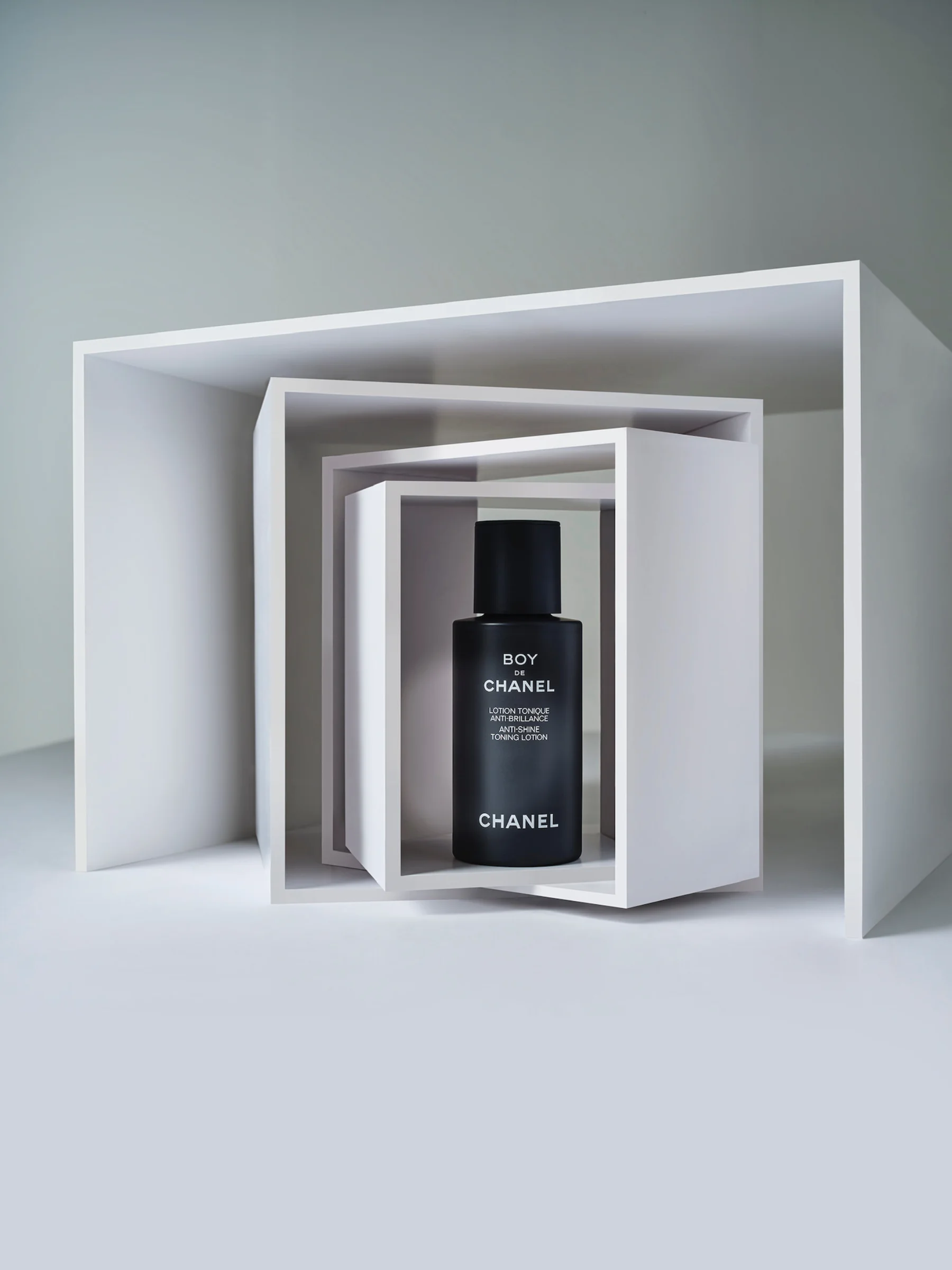
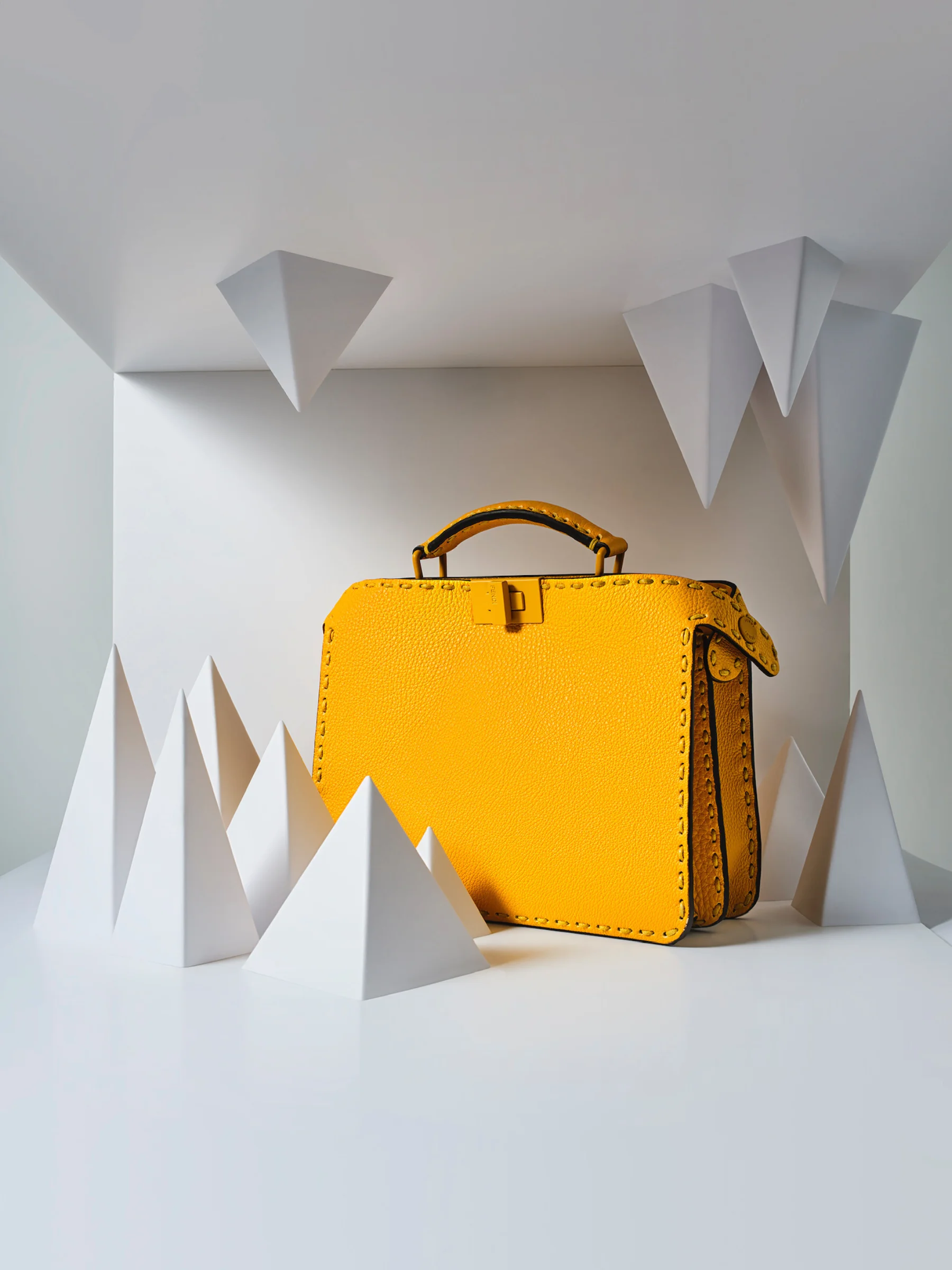
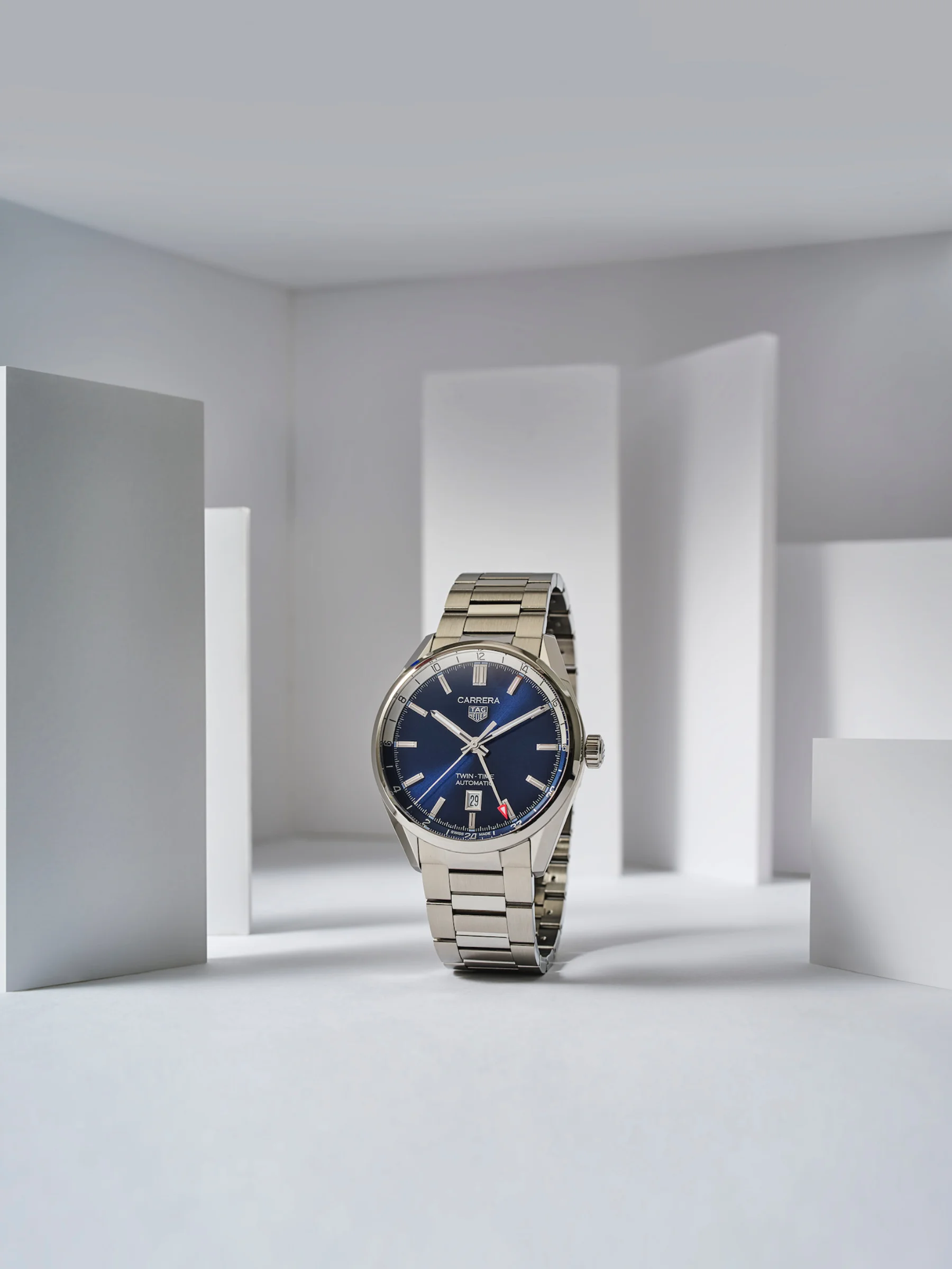
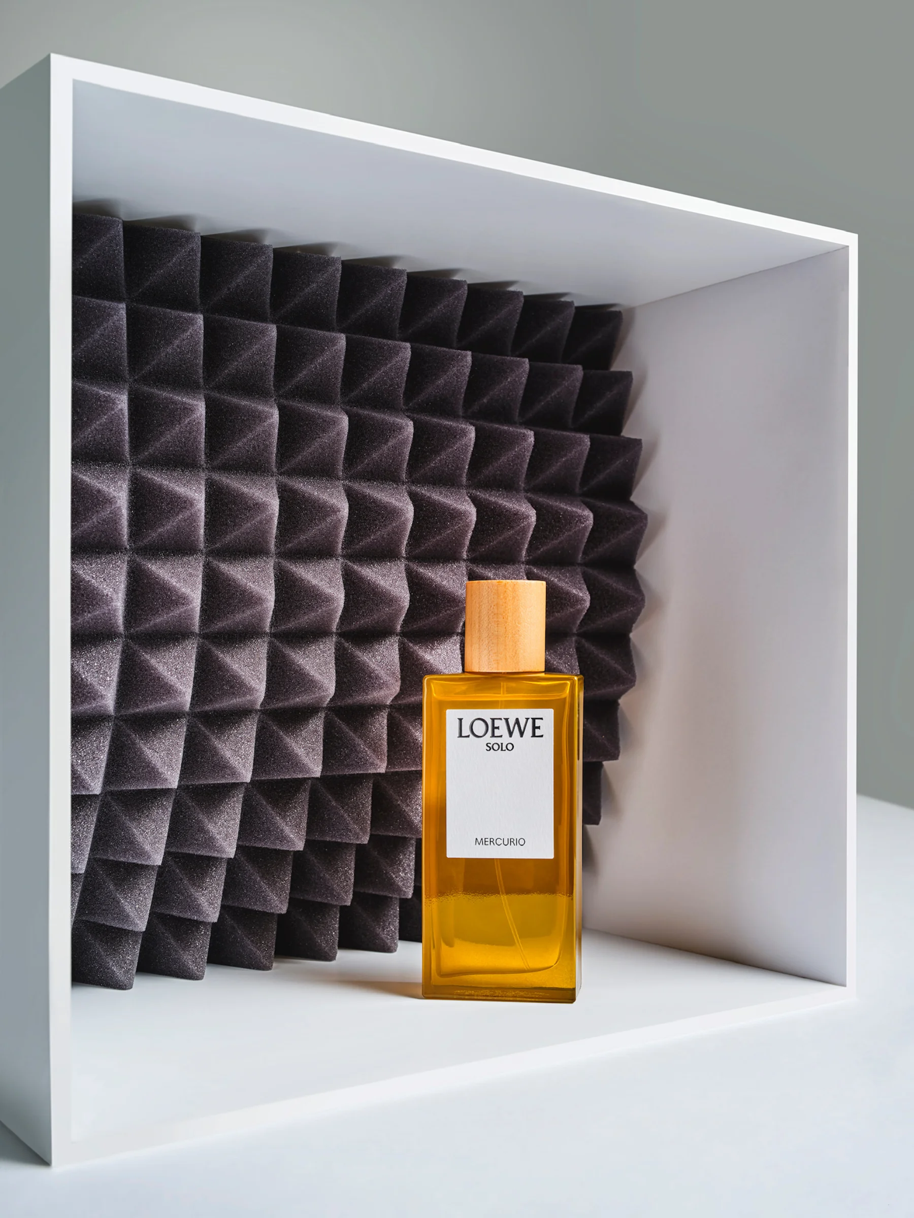
Creative direction and set design for Esquire Russia's monthly Editor's Picks column — ten products per issue, one per page, ten pages every month for three years. Ten objects with nothing in common: different brands, different sizes, different colours, different shapes. Each month, they had to become a single coherent story.
The Challenge
The products were mostly uninspiring on their own — irregular shapes, competing colours, no visual relationship to each other. The set design had to do what the objects couldn't: give the reader a reason to look, and then guide their eye directly to what was being sold. Repeat that thirty-six times across three years without repeating yourself.
The Approach
The solution was boxes. Objects living inside them, spilling outside them, balanced on their edges, hidden behind them. A white world — white backgrounds, white boxes, nothing but shadows giving the space depth and dimension. The same Siberian winter aesthetic that has always been the foundation: minimal, controlled, with light doing all the work.
The Outcome
A three-year editorial partnership with Esquire Russia. Thirty-six monthly editions, three hundred and sixty product pages — every one of them shot in Moscow under the same visual language.